

(Dynamic Advisor Solutions) The chart below shows there’s a unique trend exhibited in the stock market throughout history, depending on which year we’re in based on the four-year presidential cycle, suggesting there may be a link.
- The premise is that the first two years are weaker than the last two. During the first half of a president’s tenure, there is more focus on fulfilling campaign promises, which may not be aimed at strengthening the economy. While in the second half, we re-enter campaign mode with a push to bolster the economy in hopes of seeking a re-election.
- The weakest 12 months… is the last 12 months. Interestingly, we have just experienced the weakest year of the presidential cycle. Notice that after September of the second year, there tends to be a spike as we move into mid-term elections.
- The third year is the strongest. The economy is impacted by many factors, as is the stock market. Monetary policy, dictated by the Fed, has certainly dominated the headlines this year, but it’s important to remember that fiscal policy plays an important role as well. If we see a renewed focus on strengthening the economy from the government, there could be additional support to keep the U.S. out of a recession in 2023.
Historical Presidential Cycle Pattern
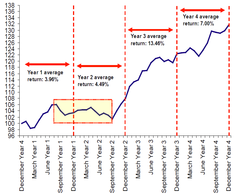
Source: Merrill Lynch, Data from 1928 through 2012
Past performance is not indicative of future returns.
As always, Dynamic recommends staying balanced, diversified and invested. Despite short-term market pullbacks, it’s more important than ever to focus on the long-term, improving the chances for investors to reach their goals.


