
Without a laboratory at hand, economists have to draw lessons from past experience. It is tempting to compare two crises: the current one generated by the novel coronavirus disease (COVID-19), and the “Global Financial Crisis” (GFC). Some major economic similarities and differences as of end-April 2020 are summarized hereafter, while many aspects go beyond this analysis, whether psychological, political, social, or basically…human.
Three major economic similarities
#1. Uncertainty: Both crises share uncertainty as a key factor once they emerged in one of the two leading economies (the United States in 2008 and China end of 2019) and spread globally.
To put it simply and following Frank Knight (1921), “uncertainty” can be defined as a non-quantifiable risk. It is a risk that cannot easily be traced so that its probability of occurrence and its impact can hardly be predicted. This applies both to the new non-visible coronavirus and to the ‘‘subprime’’ virus.
In a nutshell, subprime loans were granted to Americans with “Neither Income Nor Jobs & Assets” (NINJA) until 2007. The latter toxic risk was hidden and transferred via apparently sound securitized assets and financial vehicles so that nobody knew where and how significant the risk was. The result was a freezing of international financial relationships and a spike in uncertainty, including on the economic policies to tackle this unprecedented situation.
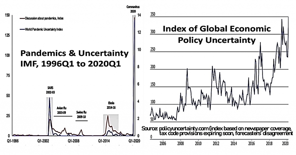
The COVID-19 crisis freezes a large chunk of merchant activities in half of the world. The World Pandemic Uncertainty Index, built by the International Monetary Fund (IMF), and the Index of Global Economic Policy Uncertainty (GEPU, computed at PPP exchange rates) now are at their highest (see Chart 1). The latter stands at 348, above the previous spikes: those of the GFC (202 in Oct. 2008), of the European Sovereign Crisis in 2011 (similar), of the Brexit Referendum (228 in June 2016) and US elections (235 in Nov. 2016) and of the Trade War, again between the United States and China (up to 342 mid 2019).
Chart 1: World Pandemic Uncertainty Index (Marc Rzepczynski) and Global Economic Policy Index
#2. Collapse: The initial drops in the stock exchanges of major countries (up to one-fourth of their valuation) have been analogous between both crises. And both global recessions have been successively qualified as the largest since the Great Depression.
Chart 2 shows the S&P 500 index from 2008 to 2020. It also provides a focus, first, on the six months following the Lehman Brother’s failure (09.16.08) and, then, on the 2.5 months observed hitherto after the historical peak of February 19, 2020. In both cases, the index was viewed as overvalued. Mid-September 2008, the earlier peak had already been partially corrected; on February 19, 2020, the index recorded a historical maximum well after COVID-19 had reached the United States.
Chart 2: US Stock Exchange 2008-2020 with 2 Focus just after Sept. 2008 & Feb. 2020
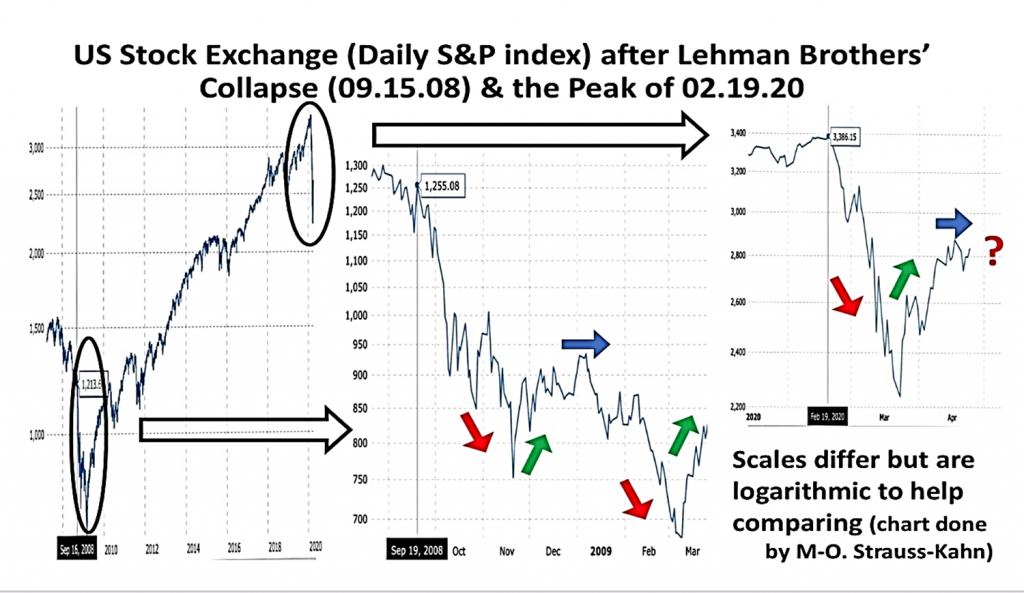
According to Robert J. Shiller, his Cyclically-Adjusted Price/Earning ratio computed on the basis of the S&P was above thirty early 2020; the historical average had been around seventeen since 1881. In April 2020, this ratio has varied above twenty. In fact, as in late 2008, equity prices as reflected by the index have rebounded in contrast with plunging economic data (see below). Thus, as in early 2009, stock exchanges may drop again, since markets are often slow to adjust and then tend to over-react.
The impact on real gross domestic product (GDP) of the “Great Lockdown,” as the IMF calls it, depends on how long/strict the lockdown is and whether there is a quick rebound without COVID-19 relapses. Initial real GDP data for quarter one 2020 in the euro area and the United States contrast with annualized drops around 16 percent and 4.8% respectively. The larger drop in the euro area reflects the earlier shock and (often stricter) lockdown.
On the basis of French estimates (INSEE and Banque de France), the shortfall due to a strict lockdown during COVID-19 is about 3 percent per month (or some 35 percent per year). This corresponds to a freezing of about half of the merchant GDP (about 70 percent of total GDP). This rule of thumb has to be adapted in many countries depending on the length/rigor of the lockdown, the share of non-merchant activities (usually computed on the sole basis of wages), and specific features like tourism.
As regards “year on year” forecasts (where the first quarters of the ongoing year weigh a lot), the IMF assumed lockdowns of about two months followed by a relatively quick recovery. As shown in Chart 3, the IMF forecasts for 2020 range between -6 percent for the United States to -8 percent for the euro area with a lower rebound in 2021 given the lower carry over at the end of 2020. The observed growth in 2009 was not as bad (except for Japan with about -7 percent in both cases), especially for China and India because these countries were hit later.
Chart 3: IMF forecasts published mid-April 2020, compared to the Global Financial Crisis (GFC)
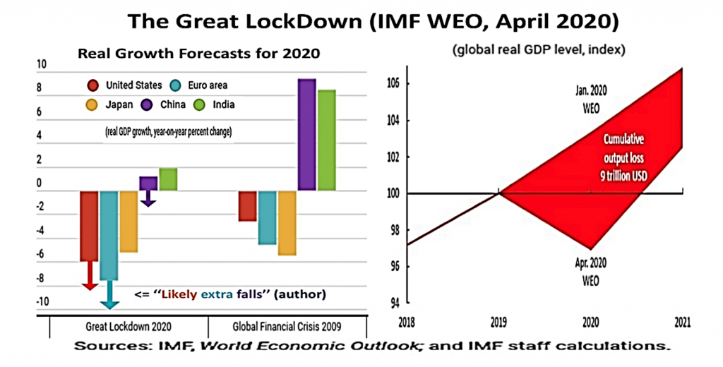
Yet, end-April 2020, the de-locking process appears more progressive and delayed by observed or potential relapses so that the outcome will likely be worse, as illustrated by the arrows added in Chart 3. The extent of uncertainty is such that, on April 30 2020, the President of the European Central Bank (ECB), Christine Lagarde, quoted a range of 5 percent to 12 percent for the euro area drop in 2020. As a result of the depth of the global recession and the free fall in oil prices, negative inflation is expected soon, which should not trigger deflationist expectations if policies react appropriately.
#3. Reactions: To limit such shocks,monetary and fiscal policies have in both cases provided massive support.
The spillover effects of the GFC were related to what were later called “Global Systemic Important Banks” (G-SIB) with contagion across borders. Similarly, the COVID-19 crisis has revealed the dependence of mature economies on some inputs produced only (or mainly) in other countries; this is perceived as jeopardizing their sovereignty. In both cases, there is a major comeback of the roles of the public authorities, the scope of regal (sovereign) powers, and the call for better regulations.
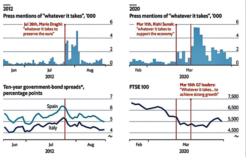
Especially in Europe, the three famous words pronounced in July 2012 by the (former) ECB President, Mario Draghi, “Whatever It Takes” have recently been repeated. They were also adapted to local conditions and the type of policies (“Whatever it Costs”). Such a formula used to preserve euro area integrity contributes to reassuring financial markets only when perceived as credible.
The echo in the media and the alleged impact on financial markets of such statements are shown in Chart 4. They are clearly visible in the summer of 2012 on the Spanish and Italian sovereign spreads versus the German Bund. The same, although less, in the case of the Group of Seven (G7) on March 16 on the UK stock exchange (FTSE 100 index, even if situations and markets differed). This was not the case when the new British Chancellor of the Exchequers alone used the same formula on March 11, 2020.
Chart 4: Use and impact of the formula “Whatever it takes” (Source: The Economist)
Four main differences resulting in a shift from the “Economic War” to the ‘‘War Economy”
#1. Process: The current exogeneous sanitary shock has affected, first, the real sector and the supply of production, then the demand side. In 2007-08 the endogenous financial shock affected the demand side first, and then morphed into the Great Recession of 2009.
The COVID-19 crisis has spread quickly all over the world given highly integrated supply chains and the physical contagion of the virus. This supply-shock then has affected the financial sector and the demand side (tourism, trade, etc.). As a producer’s constraint restrains the consumer, a demand shock emerges everywhere, worsened by psychological contagion.
The 2020 lockdown (self-quarantine at home) is identified with an “medically-induced coma,” voluntary and temporary, imposed on the economy so as to limit contagion (“flatten the curve’’). In order to minimize bankruptcies of firms and the loss of productive capital, including workers’ skills, it needs to be accompanied by medicines. In Europe more than in the United States, part-time work or technical unemployment subsidized by the governments are thus favored over firing massive numbers of employees. In addition, especially in Europe, public guarantees are provided to help banks provide the necessary loans to firms so as to survive the temporary coma.
By contrast, in 2008 the initial financial shock resulted in a burst of the housing bubble in the United States and, hence, of demand via wealth effects. Both then affected the US activity and international financial markets, leading progressively to a global recession. In order to avoid a “sudden death” of the economy, all actions were aimed at reviving finance to help the economy get out of its increasing lethargy.
In 2008, insufficiently capitalized banks were part of the problem. Financial institutions shall now be part of the solution. This is possible thanks to a better regulated financial system, despite earlier signs of reform fatigue and attempts to unwind regulatory progress in the recent years.
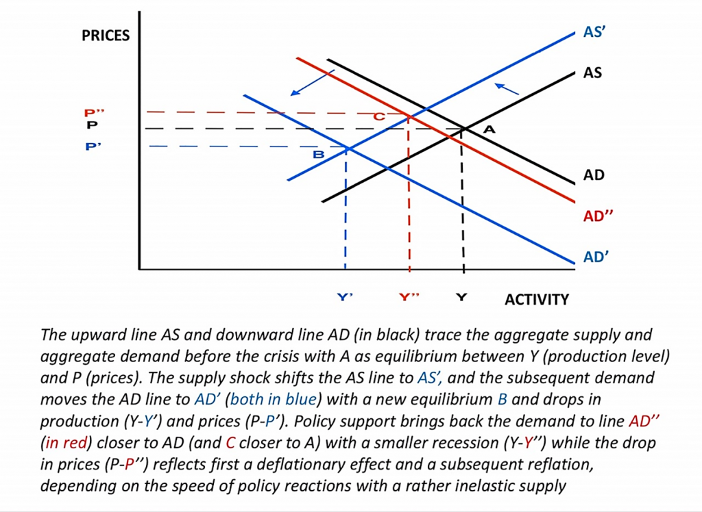
In theoretical terms, the current shock corresponds to a major leftward shift of the supply curve, followed by a resulting and possibly larger leftward shift of the demand curve. The previous shock corresponded first to a significant leftward shift of the demand curve followed by production anemia and, hence, a similar shift in the supply curve: see Chart 5 borrowed from Dominique Strauss-Kahn).
Chart 5: Shocks to Supply/Demand and Support measures to sustain demand (source DSK above)
#2. Speed and shape: A sharper but shorter “V-shaped” shock would allow real GDP to return close to its previous trend in contrast with the “U-shaped” impact of the GFC.
Everything accelerates: the virus spread and the authorities’ reactions. This remains true even if current trials and errors are criticized, both for health protection and economic policies, given the size of the damage. By contrast, the GFC was brewing before 2008 and the economic rebound was partly delayed to 2010, at least two years later. In addition, the subsequent recovery was very progressive because of persistent scars. It was even slowed down by global mini-cycles or regional double dips (W-shape due to the Sovereign crisis in the euro area or even L-shape in Greece and, to a lesser extent, in Italy).
Chart 6 illustrates the global (V-shaped) impact of a hopefully quick and coordinated policy reaction to the COVID-19 crisis, which differs from the U-shape of the Great Recession following the GFC.
Chart 6: U-shape of GFC vs a possible V-shape of the COVID-19 Crisis (as assumed by BlackRock)
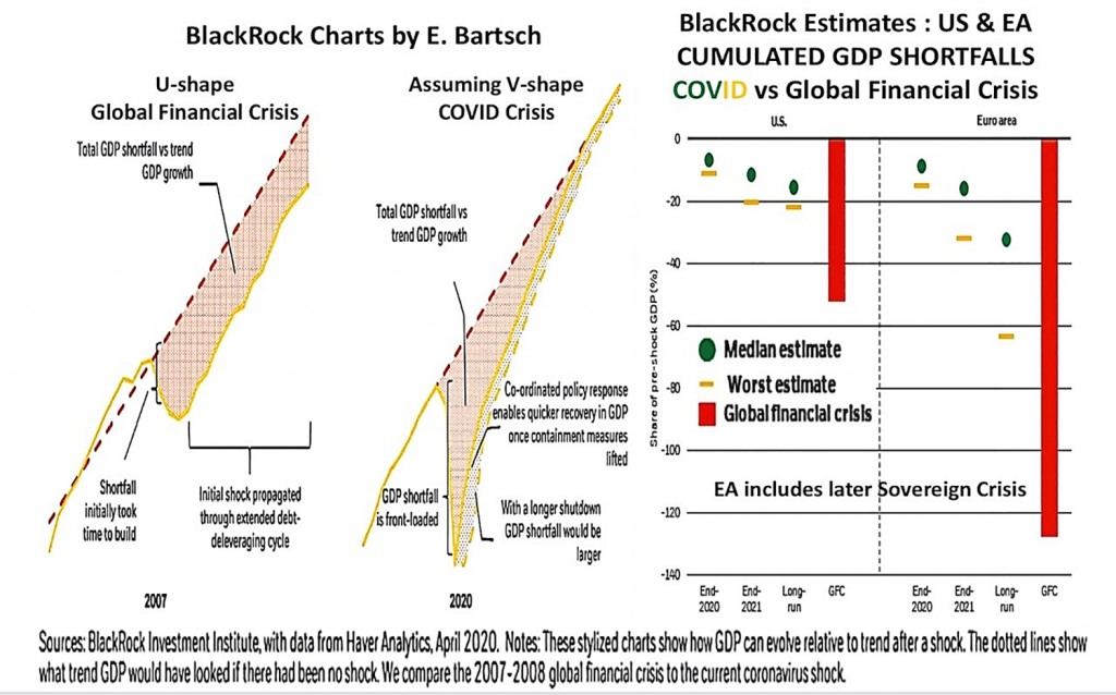
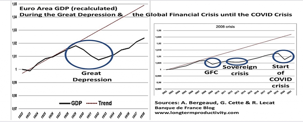
Chart 7 provides a long-term perspective for the euro area (reconstituted before 1999). It compares the cumulated impact of both crises, the GFC (followed by the double dip of the Sovereign crisis) and the COVID-19 crisis, on the one hand, with the effect of the Great Depression on the other hand.
Chart 7: Combined effect of GFC+COVID-19 crises versus that of the Great Depression for Europe
Yet, in addition to a slower rebound than hoped (looking like the shape of a Nike-“swoosh”), activity may not go back to 100 percent for some time, if only because of less tourism and transport. Moreover, lower investment for too long may affect not only the steepness of the rebound, but also the new trend of potential growth at least in the short-to-medium run.
#3. Policies: In 2020, public authorities, facing a deeper shock, seemed to have less reaction margins.
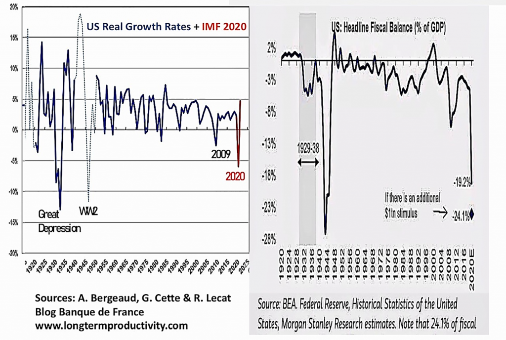
This would apply to fiscal policies, given high outstanding ratios of public debt over GDP, in most mature economies as well as in China. Yet the size and the speed of reactions have been without precedent, as illustrated in Chart 8 by the expected US fiscal deficit over GDP.
Chart 8: Long-term US graphs for Real Growth rates and Headline Fiscal Balance (as % of GDP)
In cross country comparison as in Chart 9, European fiscal support may look lower than in the United States, given the smaller size of US automatic stabilizers. In short, Europe benefits from its costly but helpful “social model.” It also tends to provide more government guarantees to loans that may not need to be used at the end of the day (below-the-line items in blue).
Chart 9: Fiscal and Monetary support in the main countries (Sources: Morgan Stanley Research)
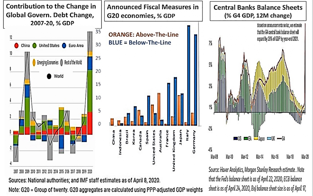
Chart 9 also illustrates the monetary policy support via the surge in central banks’ balance sheets. Early 2020, there were concerns that central banks were short of ammunition: first, short and long-term interest rates were already very low; second, outstanding liquidity was so abundant that banks could be hoarding it instead of rechanneling it to non-financial agents. Drawing the lessons from the GFC, central banks have reacted immediately and innovated in such a way that summing up their actions would require a specific article.
Some quarters argue that they should adopt “helicopter money.” In fact, whether in the United States or in Europe, central banks are de facto “monetary financing” public debt. They do so by boosting quantitative easing, via huge purchases, provided they later maintain their higher balance sheets. Thus, both their announcements and purchases prevent interest rates from rising.
This approach is easier to implement and to “sell” to some politicians than attempts to provide “helicopter money.” The latter would require central banks to reach non-financial agents directly beyond their targeted loans at lower rates via the banking sector. Banks through their commercial activities and government via taxes and subsidies have an easier access to, and better assessment of non-financial agents. Moreover, central banks’ refinancing is time-limited; and the asset purchases can be stopped and liquidity can be absorbed by selling assets back to the market (or remunerating better reserves). This would apply if reflationary risks were to jeopardize price stability over the medium run.
#4. Multilateralism: Aggregating the simultaneous reactions of major countries falls short of authentic international or regional coordination, especially between governments.
While there are many current illustrations of international coordination between central banks (including swap agreements), this is less so between governments at the global and European levels. This is a major and worrying contrast with the follow-up of the GFC. The momentum and even the spirit of global leadership seem now to have faded.
Most countries are in the same boat, now as in 2009 when the Group of Twenty (G20)—including international organizations—took the lead. Unfortunately, since then attacks on multilateralism have had lasting damaging effects.
Impediments persist on the appropriate financing or room for maneuver given to international organizations, for instance the IMF that had issued 250 billion of Special Drawing Rights (SDRs) in 2009, but none have been agreed upon in 2020. The same applies to the financing or functioning of other institutions like the World Trade Organization and the World Health Organization. And the difficulties of European leaders to agree on any “coronabond” or on a Recovery Fund demonstrates how much the European process is at stake; and this holds even if history shows that Europe has mainly progressed through, and because of, crises.
To finish on three positive notes, let’s acknowledge that:
- It took time and a new US administration in 2009 for the G20 to really start coordinating;
- A debt moratorium has been decided for the poorest countries that are likely to become the most vulnerable to the impact of the virus and the global recession;
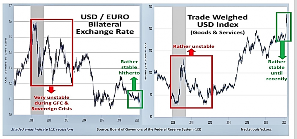
- Hitherto, there has been little exchange rate gyration between reserve currencies as exemplified in Chart 10. The bilateral exchange rate between the dollar and the euro had varied a lot from end 2007 to 2012; this is largely because the United States and the euro area where not hit at the same time; by contrast, it has not varied much recently. True, some currencies of Emerging Market Economies (EMEs) have recently depreciated significantly and the trade weighted dollar index has appreciated; but there are no statements (yet?) of “currency war” in the same way as some EMEs assessed the situation ten years ago.
Chart 10: Dollar exchange Rate versus the Euro or Trade Weighted Index
To sum up, there are more differences than similarities in comparing these two crises. Others may still emerge as time goes. History doesn’t repeat itself; it stutters. And, of course, what will matter afterwards is to really draw the appropriate lessons to revisit our development models and better prevent and/or limit future crises.
This article originally appeared on Atlantic Council.

