
(Seeking Alpha) I screened over 700 funds that had high ratings by Market Edge (Long), Morningstar (5), FactSet (NYSE:A), Ned Davis (>=4), XTF (>=9) and Mutual Fund Observer (Rating = 5) and met other criteria such as being at least five years old and having greater than $100M in assets. I summarized these by number of entities rating them highly, Lipper Category and my own Rating based on Risk, Risk Adjusted Returns, Momentum, Income, and Quality.
I then used Portfolio Visualizer to create a portfolio of funds to maximize return for the past 18 months for a volatility of 5 (similar to the Vanguard Wellesley Fund (VWIAX) and 8.5 (similar to the Vanguard Wellington Fund (VWELX)).
Fund Universe
Chart #1 is the Efficient Frontier for the funds with the most of high ratings. The link to Portfolio Visualizer for all of the Top Funds is here.
Chart #1: Efficient Frontier of Top Rated Funds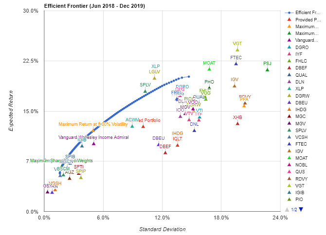
Source: Created by the Author using Portfolio Visualizer
Highest Rated Funds
The following funds were the only ones rated by at least five of the entities and also had a high rank in my Rating System.
Table #1: Most Highly Rated Funds
| DGRO | iShares Core Dividend Growth | Equity Income |
| FDL | First Trust Morningstar Div Leaders | Equity Income |
| FHLC | Fidelity® MSCI Health Care Index | Health Biotechnology |
| DBEF | Xtrackers MSCI EAFE Hedged Equity | International Multi-Cap Core |
| QUAL | iShares Edge MSCI USA Quality Factor | Large-Cap Core |
| DLN | WisdomTree U.S. LargeCap Div Fund | Large-Cap Value |
January Model Portfolio - Portfolio Visualizer
Portfolio Visualizer was used to select funds and assign allocations that maximized returns for a given volatility. The Portfolio Visualizer Backtest Asset Allocation link for a portfolio that "Maximizes Return @ 5% Volatility (approximately 40% equities) and a portfolio that "Maximizes Return @ 8.5% Volatility (approximately 60% equities) is shown compared to the iShares Moderate (approximately 40% equities) and Growth Allocation (approximately 60% equities) ETF Portfolios and Funds is provided here. The two January Portfolios are mostly domestic equities while the two iShares ETF funds contain approximately equal amounts of international equities. The two model portfolios were created for the traditional 60/40 stock to bond allocations and more conservative portfolio.
Chart #2: January Model Portfolio Performance 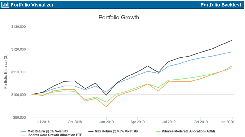
Source: Created by the Author using Portfolio Visualizer
I limited allocations to funds to 10% except for sector funds which had a maximum allocation of 5%. Portfolio Visualizer can be used by interested readers who want to test different funds or allocations.
Table #2: Results of Portfolio Optimization (Since June 2018)
| Max Rtn @ 5% Vol | Max Rtn @ 8.5% Vol | AOM | AOR | ||
| XLP | Consumer Staples Select Sector SPDR ETF | 5.0% | 5.0% | ||
| SPLV | Invesco S&P 500 Low Vol | 10.0% | 10.0% | ||
| VCSH | Vanguard Short-Term Corp Bond | 10.0% | 0.0% | ||
| FTEC | Fidelity MSCI Info Tech | 2.0% | 5.0% | ||
| MOAT | VanEck Vectors Morningstar Wide Moat | 10.0% | 10.0% | ||
| IGIB | iShares Intmdt -Term Corp Bd | 10.0% | 10.0% | ||
| LGLV | SPDR SSGA US Lrg Cap Low Vol | 10.0% | 10.0% | ||
| AGZ | iShares Agency Bond | 10.0% | 0.0% | ||
| FREL | Fidelity MSCI Real Estate | 3.0% | 5.0% | ||
| SPIB | SPDR Port Intmdt Term Corp Bd | 10.0% | 10.0% | ||
| SPTI | SPDR Portfolio Intmdt Term Trs | 10.0% | 10.0% | ||
| BSCN | Invesco BulletShares 2023 Corp Bd | 10.0% | 3.5% | ||
| DGRO | iShares Core Div Growth | 0.0% | 10.0% | ||
| FHLC | Fidelity MSCI Health Care | 0.0% | 2.0% | ||
| QUS | SPDR MSCI USA Strategic Factors | 0.0% | 9.5% | ||
| AOM | iShares Core Mod Alloc | 100% | |||
| AOR | iShares Core Growth Alloc | 100% | |||
| Metric | Max Rtn @ 5% Vol | Max Rtn @ 8.5% Vol | AOM | AOR | |
| CAGR (Return) | 11.5% | 14.4% | 7.2% | 7.7% | |
| Max. Drawdown | -2.6% | -5.9% | -4.9% | -7.5% | |
| Sortino Ratio (risk Adj Rtn) | 3.2 | 2.2 | 1.3 | 1.0 | |
| US Stocks | 39.6% | 65.8% | 20.9% | 31.1% | |
| Intl Stocks | 0.4% | 0.7% | 20.0% | 29.3% | |
| US Bonds | 49.9% | 28.7% | 41.5% | 27.5% | |
| Intl Bonds | 8.3% | 3.8% | 16.1% | 10.7% | |
| Other | 1.3% | 0.9% | 0.4% | 0.3% | |
| Cash | 0.6% | 0.2% | 1.5% | 1.2% | |
Source: Created by the Author using Portfolio Visualizer
The following three charts show the performance of the funds in the January Model Portfolio for the past 18 months.
The net outflows for equity funds (-$180.6 billion) were the group’s worst ever, surpassing the $112.9 billion pulled from equities in 2016. Domestic equity funds, which are funds that invest at least 75% of their assets in U.S. stocks, accounted for the lion’s share of net outflows (-$150.3 billion), while nondomestic equity funds had $30.3 billion leave their coffers.
- Funds Experience Second Largest Annual Net Inflows Ever In 2019
Chart #3: Equity Funds in January Model Portfolio
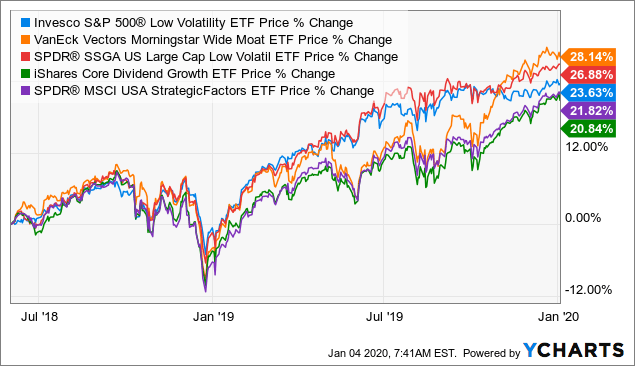 Data by YCharts
Chart #4: Sector Funds in January Model Portfolio
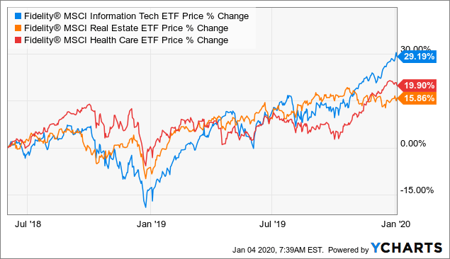 Data by YCharts
The net positive flows for taxable bond funds represented the asset group’s second largest in history, trailing only the $384.3 billion in 2009. A handful of taxable bond fund peer groups experienced banner years from a fund flows perspective, including Core Bond Funds (+$110.9 billion), Ultra Short Obligation Funds (+$33.1 billion), Core Plus Bond Funds (+$32.2 billion), and Multi-Sector Income Funds (+$28.9 billion).
- Funds Experience Second Largest Annual Net Inflows Ever In 2019
Chart #5: Bond Funds in January Model Portfolio
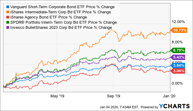 Data by YCharts
January Model Portfolio - Mutual Fund Observer
The portfolio that maximizes return with 8.5% volatility is loaded into the Mutual Fund Observer Portfolio Tool for validation. The portfolio is rated Moderate (MFO Risk =3). The Ulcer Index measures the depth and length of drawdowns is 1.7 compared to 4.4 for the S&P 500. The Martin Ratio measured the Risk Adjusted Return to be 7.2 compared to 2.4 for the S&P 500. Six of the funds are classified as "Great Owls" by Mutual Fund Observer.
Table #3: Mutual Fund Observer Portfolio Tool

Source: Created by the Author using Mutual Fund Observer
Precious Metals
Many outlooks contain a weaker dollar or higher inflation. I track gold funds as potential hedges for both of these cases. Gold has risen above $1,550. There were only 3 precious metal funds that were rated highly by at least three of the rating entities. These are iShares MSCI Global Gold Miners (RING), VanEck Vectors Gold Miners (GDX), and Aberdeen Standard Physical Palladium Shares (PALL) shown in Chart #5.
Chart #5: Precious Metal Funds
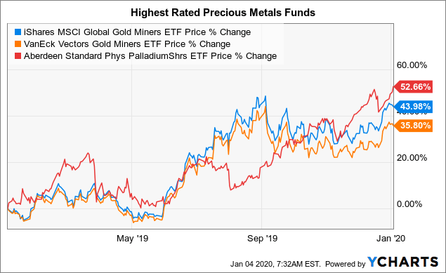 Data by YCharts
Table #3 contains all of the precious metals funds rated highly by at least one analyst/system. Chart #6 shows the efficient frontier for these funds.
Table #3: Precious Metals Funds Rated by At Least One Analyst
| Ticker | Name | CAGR | Max. Drawdown | Sortino Ratio | US Mkt Correlation |
| PALL | Aberdeen Standard Phys PalladiumShrs | 65.9% | -14.5% | 5.0 | 0.4 |
| SGOL | Aberdeen Standard Gold | 19.1% | -3.6% | 3.7 | -0.1 |
| BAR | GraniteShares Gold Trust | 19.1% | -4.0% | 3.6 | -0.1 |
| AAAU | Perth Mint Physical Gold | 19.1% | -3.9% | 3.6 | -0.1 |
| RING | iShares MSCI Global Gold Miners | 48.6% | -10.4% | 3.6 | 0.0 |
| OUNZ | VanEck Merk Gold Trust | 19.0% | -4.0% | 3.5 | -0.1 |
| IAU | iShares Gold Trust | 19.0% | -4.0% | 3.5 | -0.2 |
| GLDM | SPDR Gold MiniShares | 19.0% | -3.9% | 3.5 | -0.1 |
| GLD | SPDR Gold Shares | 18.9% | -4.1% | 3.4 | -0.2 |
| SGDM | Sprott Gold Miners | 42.6% | -10.6% | 3.3 | 0.0 |
| GDX | VanEck Vectors Gold Miners | 42.1% | -10.6% | 3.1 | -0.1 |
| GDXJ | VanEck Vectors Junior Gold Miners | 38.4% | -11.7% | 2.7 | 0.0 |
| DBP | Invesco DB Precious Metals | 16.8% | -4.8% | 2.6 | -0.2 |
Chart #6: Efficient Frontier of Precious Metals Funds
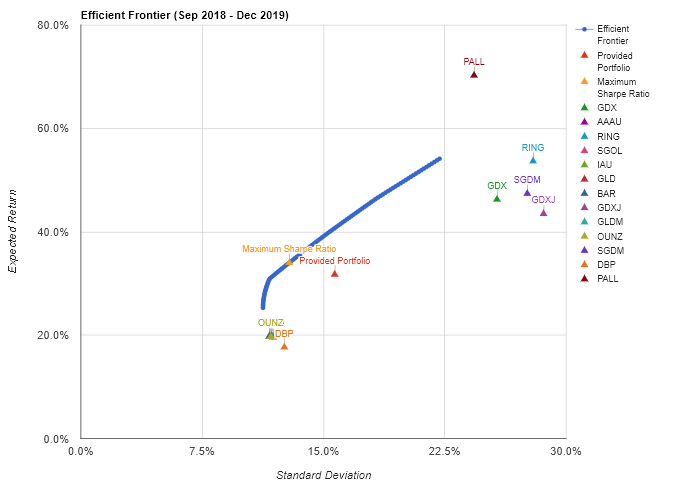
Source: Created by the Author using Portfolio Visualizer
Closing
With high budget deficits, global uncertainty, slowing profits, high valuations, and slow global growth, I expect more volatility in 2020. The market turmoil last Friday may be a window into performance during more volatile periods in 2020 and bonds, low volatility equity funds, real estate, and gold did well as shown in Chart #7. My preference is to have a tilt to the more conservative portfolio and funds.
Chart #7: Funds That Did Well Last Friday
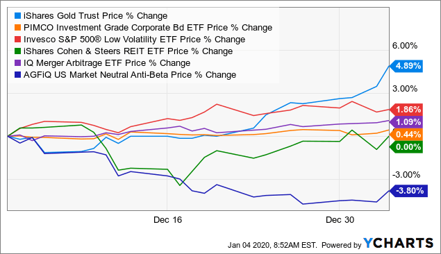 Data by YCharts
It is prudent to take a little money out of the market during these times.
Chart #8: Money Funds
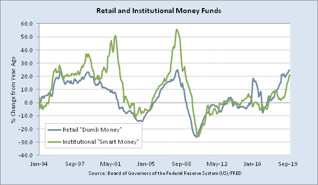
Source: St. Louis Federal Reserve

